

Visual Identity vs. Logo: What Your Business Really Needs to Look Professional

Imagine this. You meet someone at a networking event. They have a sharp blazer, but mismatched sneakers, a neon belt, and a tie with cartoon cats. You can’t decide if they are here to land a contract or lead a flash mob.
A lot of businesses look like that. They have a nice logo, but everything else feels thrown together. That’s where visual identity comes in.
So, what’s the difference?
A logo is your brand’s signature. It’s the mark people associate with your name. Think Nike’s swoosh, GraceKennedy’s wordmark, or Apple’s bitten apple.
A visual identity is the full wardrobe. It includes your colours, fonts, imagery style, and layout rules. It’s how your brand shows up everywhere, from packaging to social media to invoices.
If your logo is a handshake, your visual identity is the conversation that follows.
Why the logo alone isn’t enough
Relying only on a logo is like relying on your signature outfit for every situation. Sure, that suit might work for a meeting, but you’ll look out of place at the beach.
When your brand materials all look different, it:
Confuses your audience
Makes you appear less professional
Weakens brand recognition
Strong visual identity fixes this by creating a consistent, memorable look.
A small brand example that got it right
Picture a new Kingston-based fitness studio with a bold, modern logo in bright orange. At first, they put the logo everywhere: flyers, social media posts, water bottles, but each piece looked like it belonged to a different business. Random filters on Instagram, clashing colours on flyers, mismatched merchandise. The logo was strong, but the brand felt scattered.
They created a simple visual identity system: one consistent colour palette (their signature orange with charcoal grey), two fonts for all materials, and a clean, energetic photography style. Overnight, everything connected.
Here’s why this matters to you:
It shows how inconsistency hurts recognition. Even a great logo can’t fix a mixed-up look.
It proves small changes make a big impact. A colour palette, fonts, and photo style are easy to lock in and instantly improve your brand’s presence.
It makes your marketing work harder. The studio’s posts started getting recognised, even without the logo showing, because the visual style was so clear.
The logo stayed exactly the same. The difference was turning it into part of a complete visual identity, which is what truly makes a brand look professional.
How big brands do it
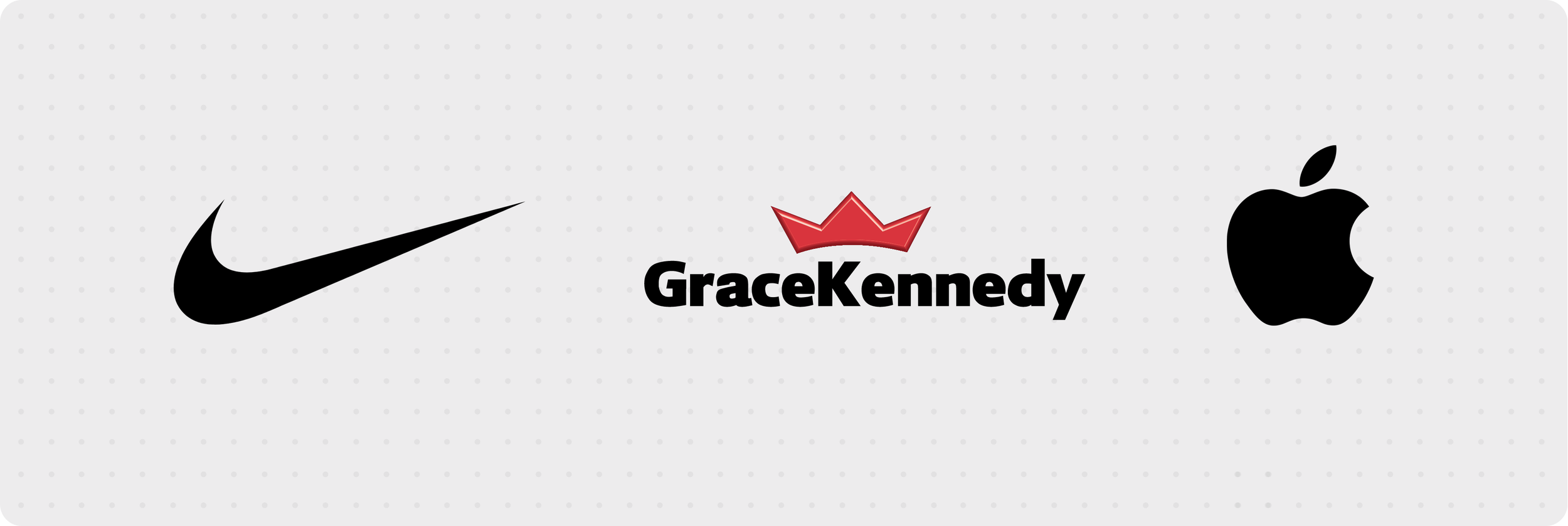
Nike uses black, white, and bold photography that focuses on movement and grit. Even without the swoosh, you’d know it’s them.
GraceKennedy keeps a consistent red and white palette across packaging, ads, and digital channels, making them instantly recognisable in stores.
Apple sticks to clean lines, minimal colours, and high-quality imagery to keep the brand premium.
Their logos are famous, but their visual identities are what make them impossible to miss.
Building your own visual identity
You don’t need a massive budget to get started. Focus on:
Colour palette: Choose 2 to 4 main colours that reflect your brand personality.
Typography: Pick one font for headings and one for body text.
Imagery style: Decide if your photos should be bright, moody, minimal, or vibrant.
Logo usage rules: How it should appear, where it should go, and what not to do.
Create a simple style guide and apply it everywhere.
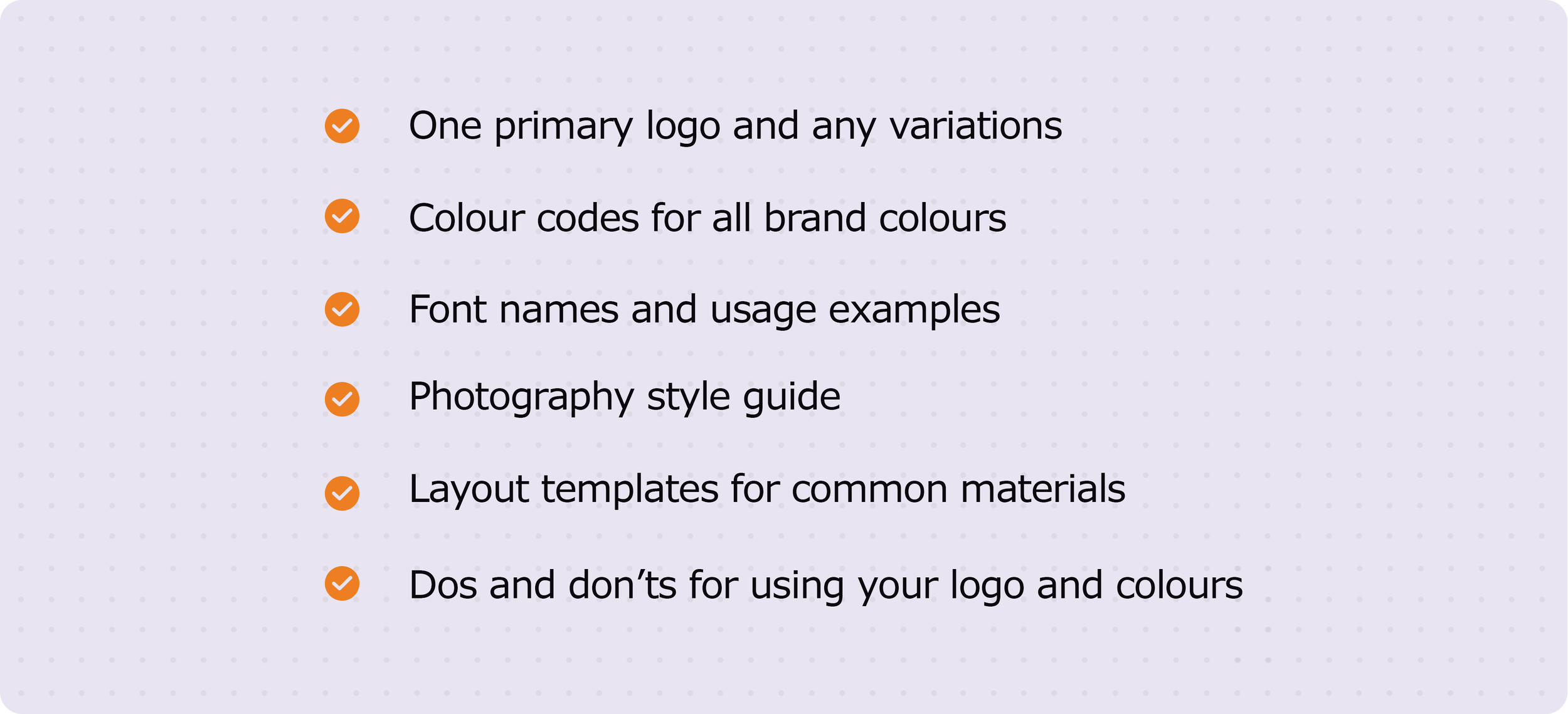
Visual Identity Starter Checklist
Bringing it back to the start
Remember our sharp blazer, neon belt, and cartoon tie friend? They might be memorable, but not for the right reasons. When your brand has a strong visual identity, people notice for the right reasons: consistency, clarity, and professionalism.
Your logo might be the face, but your visual identity is the personality, style, and voice that make your business unforgettable.